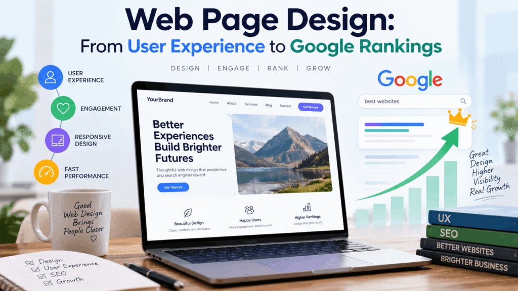
SEO web page design is the practice of building websites that satisfy both human visitors and search engine algorithms simultaneously. Every design decision you make—from site architecture and page layout to image optimization and front-end performance—directly influences how search engines crawl, index, and rank your pages. This guide explores the design principles that bridge the gap between user experience and Google rankings, covering everything from Core Web Vitals to mobile-first indexing and the trust signals that matter most in 2026.
Why Design Decisions Are SEO Decisions
Google’s ranking algorithms increasingly evaluate user experience signals alongside traditional factors like content relevance and backlinks. The core ranking systems look to reward content that provides a good page experience, and site owners should check whether they’re providing an overall great experience across many aspects rather than focusing on only one or two.
The signals that matter most—Core Web Vitals, mobile-friendliness, and engagement metrics—are shaped almost entirely by design and front-end engineering choices. Google ranks pages based on user experience signals, and UX decisions involving page speed, navigation structure, layout, and content hierarchy directly affect SEO performance.
Core Web Vitals: The Measurable Side of UX
Core Web Vitals are Google’s specific, measurable indicators of page experience that directly tie UX performance to search rankings. Google has confirmed that these metrics are used by its ranking systems and recommends achieving good Core Web Vitals for success with search.
The three metrics are
Largest Contentful Paint (LCP) measures how quickly the largest visible element—usually a hero image or heading—loads. The target is under 2.5 seconds. A slow LCP means users stare at a blank or partially loaded page, increasing the likelihood they’ll leave before content even appears.
Interaction to Next Paint (INP) measures the responsiveness of the page to user interactions throughout the entire visit. The target is under 200 milliseconds. Sluggish interactions make a page feel broken, and Google measures this at the 75th percentile—meaning 75% of user experiences must meet the threshold.
Cumulative Layout Shift (CLS) measures how much the page layout shifts unexpectedly during loading, with a target under 0.1. Layout shifts are among the most frustrating user experiences.
These three signals are shaped by design. Heavy image files, custom fonts loaded without fallback strategies, and animations that trigger layout recalculations are not accidental problems—they’re the residue of design processes that prioritize appearance without accounting for delivery.
Mobile-First Indexing: The Mobile Version Is Your Website
Google uses the mobile version of a site’s content for indexing and ranking—a system known as mobile-first indexing. This approach, often referred to as mobile indexing, makes it important for websites to provide a complete, mobile-friendly version of their content. While having a mobile version isn’t required for content to appear in Google’s Search results, it is very strongly recommended.
Google recommends responsive web design because it serves the same HTML code on the same URL regardless of the user’s device, making it the easiest design pattern to implement and maintain. A layout that works on desktop but breaks on mobile will underperform regardless of content quality.
The practical implications are significant. The mobile version of your site is, by default, the version being evaluated for ranking. This means touch elements need plenty of space, navigation must remain simple, and pages should load in under three seconds.
Site Architecture and Semantic HTML

Site architecture is where web design and SEO meet most directly. A well-structured site helps both users and search engine crawlers find content efficiently. Every important page should be reachable within 2–3 clicks from the homepage, and URLs should be descriptive and keyword-relevant rather than parameter-heavy.
Heading hierarchy isn’t just a typographic convention—it’s a signal. When an H1 is used correctly, it identifies the primary subject of a page. When heading levels are applied arbitrarily for visual effect, that signal degrades. A designer who uses heading tags for styling purposes rather than semantic structure is effectively scrambling the page’s outline for every crawler that reads it.
Accessibility best practices — semantic HTML, alt text, heading hierarchy — directly improve search engine comprehension. These aren’t separate from SEO; they’re foundational to it.
E-E-A-T and the Trust Layer
Google’s E-E-A-T guidelines (Experience, Expertise, Authoritativeness, and Trustworthiness) represent a set of quality signals that help the search engine identify high-quality content in order to provide web users with the best possible experience. E-E-A-T encourages SEO professionals to focus on creating helpful websites that maximize user experience, which usually means creating content that is useful and trustworthy, as well as authoritative and expert in its field.
The E-E-A-T framework reinforces that UX and SEO are no longer separate disciplines. Google’s ranking algorithms evaluate user experience signals—Core Web Vitals, mobile usability, page speed, and engagement metrics—alongside traditional factors. Sites with poor E-E-A-T tend to be heavily penalized, while sites deemed to have good E-E-A-T see higher search engine rankings.
The Takeaway
SEO web page design isn’t about choosing between aesthetics and rankings. The design choices that make a site pleasant to use—fast loading, stable layouts, responsive breakpoints, clear heading structures—are the same choices that Google’s algorithms reward. When design and SEO work together, the result is a site that performs well for both users and search engines. When they’re treated as separate workstreams, you end up with a beautiful site that nobody can find.
Looking to create SEO-friendly web pages that deliver a seamless user experience, improve Google rankings, attract the right visitors, and turn website traffic into real business opportunities—not just focus on making your website look good?
Get in touch with Technical Speaks today and discover how strategic SEO web page design can improve user experience, strengthen your search visibility, and help your business reach the right customers.