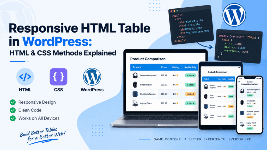
Creating a responsive HTML table in WordPress requires understanding both the markup structure and the CSS techniques that make tabular data readable on any screen size. Whether you’re building a comparison chart, pricing table, or data-heavy report, a table that overflows horizontally on mobile frustrates users and hurts accessibility. Optimizing your table structure and styling can also support better WordPress speed by reducing unnecessary elements and keeping the page lightweight. This guide explains the core HTML and CSS methods for achieving responsiveness, along with practical WordPress implementation options.
Why Responsive Tables Matter
HTML tables were designed for displaying structured data, but their rigid column layout creates challenges on narrow screens. A table with six columns might look fine on a desktop monitor, yet become completely unusable on a smartphone without proper handling.
The stakes go beyond aesthetics. Responsive tables touch all three Core Web Vitals: layout shifts (CLS) from tables rendering without reserved dimensions, largest contentful paint (LCP) if a table dominates the viewport, and interaction to next paint (INP) when sorting or filtering runs on the main thread. Using clear HTML headings to structure the content around your table can also improve readability and accessibility. A poorly implemented table can degrade your WordPress site’s performance metrics alongside its usability.
Accessibility adds another layer. Screen readers like JAWS, NVDA, and Voice Over-rely on programmatic table structure to announce column headers when users navigate between cells. Methods that strip display: table without restoring ARIA roles break that association entirely.
Core HTML Structure for Responsive Tables
Before applying any CSS, the table itself needs proper semantic markup. WordPress tables should always include these elements:
<table>
  <caption>Monthly Sales Report</caption>
  <thead>
    <tr>
      <th scope="col">Product</th>
      <th scope="col">Revenue</th>
      <th scope="col">Units</th>
    </tr>
  </thead>
  <tbody>
    <tr>
      <td data-label="Product">Widget A</td>
      <td data-label="Revenue">$12,000</td>
      <td data-label="Units">450</td>
    </tr>
  </tbody>
</table>
The <caption>, <thead>, <th scope>, and data-label attributes all serve specific purposes. The data-label attribute becomes essential for CSS-based stacking methods, as it provides the column context when headers are hidden on mobile.
CSS Method 1: Horizontal Scrolling Overflow
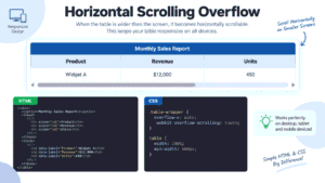
The simplest approach wraps the table in a container with overflow-x: auto. This preserves the native table structure perfectly—no ARIA patches needed—while letting users swipe horizontally to see all columns.
.table-wrapper {
  overflow-x: auto;
  -webkit-overflow-scrolling: touch;
}

table {
  width: 100%;
  min-width: 600px;
}
When to use it: Tables with many columns where truncating or stacking would lose critical context. The overflow wrapper keeps all <th scope>, <caption>, and table hierarchy intact for screen readers without modification.
Trade-off: Users must scroll horizontally, which some find less intuitive than stacked layouts. The min-width should reflect the narrowest the table can be before content becomes cramped.
CSS Method 2: Stacked Block Reflow
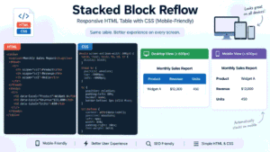
This method transforms table rows into card-like blocks on small screens. Each <td> becomes a block-level element, with the column header displayed via the data-label attribute and a ::before pseudo-element.
@media screen and (max-width: 600px) {
  table, thead, tbody, th, td, tr {
    display: block;
  }

  thead tr {
    position: absolute;
    top: -9999px;
    left: -9999px;
  }

  td {
    position: relative;
    padding-left: 50%;
    border: none;
    border-bottom: 1px solid #eee;
  }

  td::before {
    content: attr(data-label);
    position: absolute;
    left: 6px;
    width: 45%;
    padding-right: 10px;
    font-weight: bold;
  }
}
Critical accessibility warning: This method replaces display: table with display: block, which destroys the programmatic table structure screen readers depend on. You must add role="table", role="row", role="columnheader", and role="cell" to restore it.
Additionally, CSS pseudo-content from content: attr(data-label) is not reliably announced by NVDA or VoiceOver on iOS. Use aria-label directly on each <td> instead of relying solely on the visual ::before content.
CSS Method 3: Flexbox and Grid
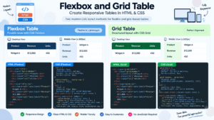
1. Flexbox Table — CSS
.table {
display: flex;
flex-direction: column;
border: 1px solid #e5e7eb;
border-radius: 8px;
overflow: hidden;
}

.table-header,
.table-row {
display: flex;
}

.cell {
flex: 1;
padding: 12px 16px;
border-right: 1px solid #e5e7eb;
}

.cell:last-child {
border-right: none;
}

.table-header {
font-weight: 700;
background: #f3f4f6;
}

/* Mobile */
@media screen and (max-width: 600px) {
.table-header {
display: none;
}

.table-row {
flex-direction: column;
border-bottom: 1px solid #eee;
}

.cell {
border: none;
padding: 10px 12px;
}

.cell::before {
content: attr(data-label);
display: block;
font-weight: 700;
margin-bottom: 4px;
}
}
2. CSS Grid Table — CSS
.grid-table {
display: grid;
border: 1px solid #e5e7eb;
border-radius: 8px;
overflow: hidden;
}

.grid-header,
.grid-row {
display: grid;
grid-template-columns: repeat(3, 1fr);
}

.cell {
padding: 12px 16px;
border-right: 1px solid #e5e7eb;
border-bottom: 1px solid #e5e7eb;
}

.cell:last-child {
border-right: none;
}

.grid-header {
font-weight: 700;
background: #f3f4f6;
}

/* Mobile */
@media screen and (max-width: 600px) {
.grid-header {
display: none;
}

.grid-row {
grid-template-columns: 1fr;
}

.cell {
border-right: none;
}

.cell::before {
content: attr(data-label);
display: block;
font-weight: 700;
margin-bottom: 4px;
}
}
Flexbox and Grid offer more sophisticated control but introduce the same accessibility concerns as block reflow. These methods manipulate display values away from native table rendering, requiring ARIA roles to preserve semantics.
Flexbox works well for horizontal scrolling with sticky first columns, while Grid enables complex arrangements where cells span multiple columns on different breakpoints. Both methods demand careful testing with assistive technology.
The WebAIM Screen Reader User Survey found JAWS and NVDA nearly tied in desktop usage (41% and 38%), with VoiceOver dominating mobile at 70.6%. Testing across these tools is essential before deploying any method that alters native table display.
Implementing Responsive Tables in WordPress
Using the Block Editor Table Block
WordPress’s built-in table block provides basic table creation, but its responsive controls are limited compared with what some WordPress themes and page builders offer. The block supports header sections, alignment, and color options but does not natively offer stacking or column priority on mobile.
You can enhance the table block by adding custom CSS through your theme or a plugin. The block outputs standard HTML table markup, so any CSS method described above will apply.
Adding Custom HTML in WordPress
WordPress offers several ways to add raw HTML tables:
Custom HTML Block: Add a block, search for “Custom HTML,” and paste your complete table markup and any inline <style> tags. This works for standalone tables and lets you control elements such as HTML heading sizes while keeping your code self-contained.
Edit as HTML: For existing blocks, click the three-dot menu and select “Edit as HTML” to modify the underlying markup directly.
Code Editor: The full-page code editor (accessible from the top-right three-dot menu) shows all block markup, useful for debugging or bulk table edits.
CSS Injection Options
For styles that apply site-wide:
Additional CSS: Navigate to Appearance → Customize → Additional CSS in the WordPress Customizer.
Child theme style. CSS: Add rules to your child theme for version-controlled styling.
Code snippets plugin: Tools like WPCode let you add CSS and HTML snippets from the dashboard without touching theme files
If you need to embed styles within a post, a Custom HTML block can contain <style> tags, though this becomes difficult to maintain across many pages.
Plugin Solutions for Automatic Responsiveness
When manual implementation isn’t practical, WordPress plugins can automate the process.
Make Tables Responsive transforms tables into a two-column mobile layout: column names on the left, data on the right. It works automatically on post/page content, widgets, and excerpts without JavaScript on the front end. However, it skips tables with merged cells and requires column names in the first row.
Auto Responsive Table targets existing tables built with Classic Editor, Gutenberg, or raw HTML. Beyond responsiveness, it adds sticky headers and sortable columns.
SoraStyle Table Block Extension enhances the native WordPress Table block with per-block responsive toggles for horizontal scrolling and vertical stacking on mobile.
For Elementor users, Responsive Table for Elementor provides a widget that converts tables up to five columns into stacked cards on mobile.
Choosing the Right Method
| Method | Best For | Accessibility Impact | Maintenance |
|---|---|---|---|
| Overflow wrapper | Wide tables with many columns | Minimal—native structure preserved | Low |
| Stacked block reflow | Narrow tables (3-5 columns) | Requires ARIA roles and aria-label | Medium |
| Flexbox/Grid | Custom responsive patterns | Requires ARIA roles | High |
| Automatic plugins | Legacy tables, non-technical users | Varies by plugin | Low |
For most WordPress sites, the overflow wrapper offers the best balance of simplicity, accessibility, and reliability. Stacked layouts work well for smaller datasets where horizontal scrolling would be excessive but demand careful attention to ARIA roles and testing with screen readers.