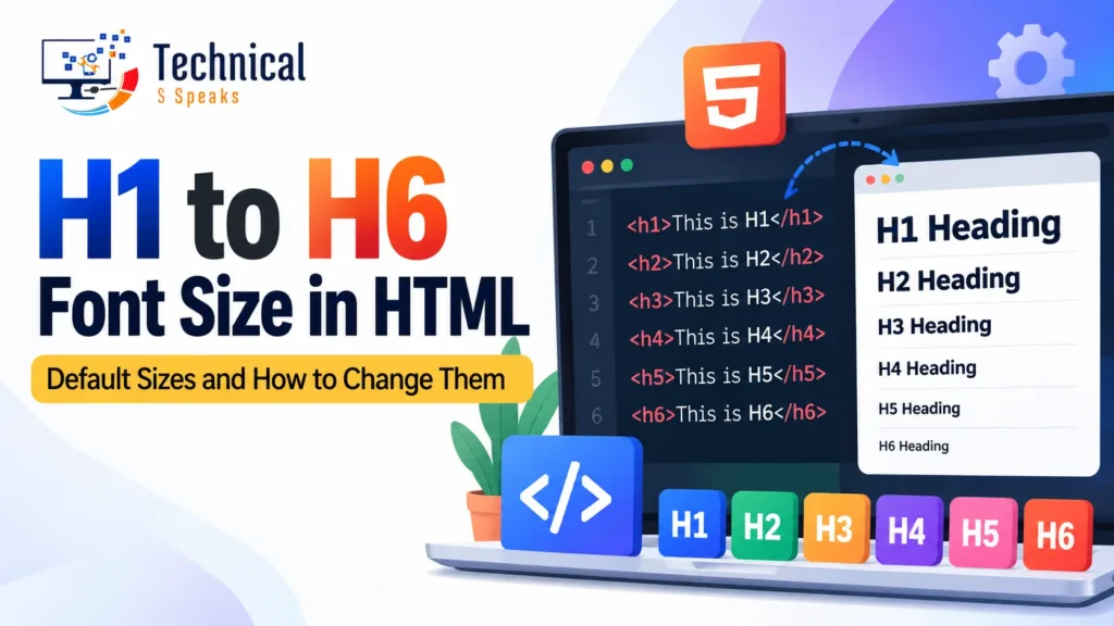
In most browsers, the default h1 to h6 font sizes are 2em (32px), 1.5em (24px), 1.17em (about 18.7px), 1em (16px), 0.83em (about 13.3px) and 0.67em (about 10.7px), assuming the usual 16px base font. You can change any of them with CSS, and you should choose a heading level for its place in the structure, not for its size.
Below you’ll find the full size table, copy-paste CSS, a responsive approach, and the mistakes that trip up beginners.
What are HTML headings?
HTML has six heading tags, <h1> to <h6>. They mark the titles of sections on a page, from the most important (<h1>) down to the least (<h6>).
<!DOCTYPE html>
<html lang="en">
<head>
  <title>Heading Example</title>
</head>
<body>
  <h1>Main heading</h1>
  <h2>Level 2 heading</h2>
  <h3>Level 3 heading</h3>
  <h4>Level 4 heading</h4>
  <h5>Level 5 heading</h5>
  <h6>Level 6 heading</h6>
</body>
</html>
Headings always go inside <body>, never directly inside <html>.
Default font size of h1 to h6
| Tag | Default size (em) | Pixels (16px base) | Typical use |
|---|---|---|---|
<h1> | 2em | 32px | Page title |
<h2> | 1.5em | 24px | Main sections |
<h3> | 1.17em | ~18.72px | Subsections |
<h4> | 1em | 16px | Smaller subsections |
<h5> | 0.83em | ~13.28px | Rarely used |
<h6> | 0.67em | ~10.72px | Rarely used |
All six are bold by default and have some top and bottom margin.
Two things to know:
- These are browser defaults. Your WordPress theme or CSS framework almost always overrides them, so your real sizes may be different.
- em is relative. If the parent element’s font size changes, the heading sizes change with it.
Watch for nested h1 sizes: older browser stylesheets made an <h1> inside <article>, <section>, <aside> or <nav> smaller, so it looked like an <h2>. Browsers are removing this rule, but setting an explicit h1 { font-size: … } avoids the issue entirely.
How to change heading font size with CSS
Set your own sizes in your stylesheet:
h1 { font-size: 2.5rem; }    /* 40px */
h2 { font-size: 2rem; }      /* 32px */
h3 { font-size: 1.5rem; }    /* 24px */
h4 { font-size: 1.25rem; }   /* 20px */
h5 { font-size: 1.125rem; }  /* 18px */
h6 { font-size: 1rem; }      /* 16px */
px vs em vs rem
| Unit | Relative to | When to use |
|---|---|---|
px | Nothing (fixed) | Quick tests; ignores the user’s browser font setting |
em | Parent’s font size | Components that should scale with their container |
rem | Root (<html>) font size | Best default for headings: predictable and respects user settings |
For most sites, rem is the safest choice. If a reader raises their browser’s default text size, rem headings grow with it, which helps accessibility.
Changing one heading only
To style a single heading without touching the rest, use a class:
<h2 class="section-title">Our Services</h2>.section-title {
font-size: 1.75rem;
color: #1a1a1a;
}Responsive heading sizes with clamp()
A 40px heading looks great on a laptop and cramped on a phone. clamp() scales the size with the screen width between a minimum and a maximum:
h1 { font-size: clamp(1.75rem, 4vw + 1rem, 3rem); }
h2 { font-size: clamp(1.5rem, 3vw + 0.75rem, 2.25rem); }
h3 { font-size: clamp(1.25rem, 2vw + 0.5rem, 1.75rem); }
Read it as clamp(smallest, preferred, largest). It needs no media queries and works in all modern browsers.
Using heading levels correctly
Choose the level by structure, not size
Don’t use <h4> just because you want smaller text. Pick the level that fits the outline, then style it with CSS. A page should read like a table of contents:
H1: HTML Headings Guide
  H2: Default sizes
  H2: Changing sizes with CSS
    H3: px vs em vs rem
    H3: Changing one heading
  H2: FAQ
Don’t skip levels
Going from <h2> straight to <h4> confuses screen reader users, who often jump through a page by its headings. Go down one level at a time. Going back up (h4 to h2) is fine when a new section starts.
One h1 per page (as a best practice)
Google has said multiple H1s won’t hurt your rankings, but one clear H1 that names the page topic is still the cleanest choice for readers and accessibility.
WordPress tip: most themes turn the post title into the H1 automatically. Start your content at H2 in the editor so you don’t end up with two.
Don’t use headings for non-heading text
Putting a phone number or a promo line in <h2> just to make it big is a common mistake. Use a <p> or <span> with a class.
Do headings help SEO and AI answers?
Yes, though indirectly. Clear headings help search engines and AI answer engines understand what each section covers, and they make it easier to pull a section as a featured snippet or a cited answer. Question-style H2s (“What is the default h1 font size?”) followed by a direct one or two sentence answer work especially well.
For the SEO side in depth, see how to use HTML headings to improve your website, our on-page SEO checklist and how to get featured snippets.
Common mistakes with HTML headings
- Choosing heading tags by size instead of structure
- Skipping levels (h2 straight to h4)
- Two H1s in WordPress (the theme title plus one in the content)
- Stuffing keywords into every heading
- Using bold paragraphs as fake headings, which screen readers and search engines won’t treat as headings
- Fixed
pxsizes that don’t adapt on mobile
Several of these also appear in our list of technical SEO mistakes.
FAQ
What is the default font size of h1 in HTML?
2em, which is 32px when the base font size is 16px.
What is the font size of h1 to h6 in px?
h1 32px, h2 24px, h3 about 18.72px, h4 16px, h5 about 13.28px, h6 about 10.72px (browser defaults, 16px base).
How do I change the h1 font size?
Add a CSS rule such as h1 { font-size: 2.5rem; }. To make it responsive, use clamp().
Is h4 the same size as normal text?
By default, yes. <h4> is 1em, the same as body text, but it’s bold.
Can I use more than one h1 on a page?
It’s technically allowed and Google says it won’t hurt rankings, but one H1 per page is the clearer best practice.
Should I use px, em or rem for headings?
rem is the best default. It’s predictable and respects the user’s browser font settings.
Final thoughts
The default h1 to h6 font sizes run from 32px down to about 10.7px, but your theme and CSS decide what readers actually see. Pick heading levels for structure, set sizes in rem, make them responsive with clamp(), and your pages will be easier to read, more accessible and easier for search engines to understand.
Building or fixing a website? See our guides on SEO for a new website, creating a landing page, meta tags and responsive HTML tables in WordPress. Need a hand? Get in touch with our team today.
Saurabh K. writes practical web development and SEO guides for beginners.