To create a landing page that converts, pick one goal, match the page’s message to the ad or link that brought the visitor there, lead with a clear headline and one call to action, add proof, keep the form short, and make the page load fast on mobile. Then track conversions and test one change at a time.
Below is the full process: what to put on the page section by section, how to build it, and how to keep improving it after launch.
What is a landing page?
A landing page is a standalone page built for one specific action, such as booking a call, downloading a guide or buying one product. Visitors usually arrive from an ad, an email, a social post or a search result.
Landing page vs. homepage
| Landing page | Homepage | |
|---|---|---|
| Goal | One action | Many (explore, learn, contact) |
| Navigation | Minimal or none | Full menu |
| Audience | One campaign or segment | Everyone |
| Message | Matches a specific ad or offer | General brand overview |
| Success measure | Conversion rate | Engagement across the site |
Sending ad traffic to your homepage is one of the most common ways to waste budget. Visitors have to hunt for what they clicked on.
Step 1: Define one goal and one audience
Decide what a “conversion” means for this page: a form fill, a call, a purchase or a sign-up. Then write one sentence describing who it’s for.
Example: “Clinic owners in Pune who want more appointment bookings from Google.”
Everything else on the page, including the headline, images, proof and form, should serve that one person and that one action.
Step 2: Match the message to the traffic source
Message match means the page repeats the promise that got the click. If the ad says “Free SEO audit for dental clinics,” the headline should say the same thing, not “Welcome to our digital agency.”
Good message match:
- Uses the same key phrase as the ad or email
- Shows the offer the visitor expects, straight away
- Keeps the same tone and visuals
For Google Ads, strong message match also helps landing page experience, which is part of Quality Score. If you run paid campaigns, see our guide to search engine marketing consultants.
Step 3: Plan the page structure
Most high-converting landing pages follow a similar flow:
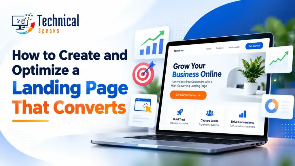
- Hero section: a headline, a one-line subheadline, the main CTA and a relevant image or short video.
- Problem and benefit: what the visitor is struggling with and what changes for them.
- How it works: three or four simple steps.
- Proof: testimonials, client logos, ratings, results or case studies.
- Details: features, what’s included, pricing (if relevant).
- Objections: a short FAQ answering “How long?”, “How much?”, “What if…?”
- Final CTA: repeat the offer and the button.
Short, simple offers (a free download) can skip some sections. Bigger decisions (a high-priced service) usually need more proof and more answers before people act.
Step 4: Write a clear headline and subheadline
Your headline should tell visitors what they get, not how great you are.
| Weak | Strong |
|---|---|
| “Welcome to XYZ Digital” | “Get More Patient Bookings From Google in 90 Days” |
| “Innovative Solutions for Your Business” | “Free Website Speed Audit: Find What’s Slowing You Down” |
| “The Best SEO Services” | “SEO for Local Clinics: More Calls, No Long Contracts” |
(These are example headlines. Only promise timelines or results you can back up.)
The subheadline adds the “how” or “for whom” in one line. Use one clear H1 for the headline. Our guide to HTML headings and font sizes explains how to structure the rest.
Step 5: Write benefit-led copy
- Lead with the outcome (“save 5 hours a week”), then explain the feature that delivers it.
- Use short paragraphs, bullet points and subheadings so people can skim.
- Speak to one reader using “you.”
- Answer the main doubts directly instead of avoiding them.
- Cut anything that doesn’t help the visitor decide.
AI tools can help you brainstorm headline and CTA variations quickly. Edit them yourself so the copy sounds like your brand and every claim is true.
Step 6: Design for clarity and mobile
- Make the CTA button stand out with contrasting color and plenty of space around it.
- Remove the main navigation menu, or keep it minimal, so visitors stay focused.
- Use real photos of your team, product or results instead of generic stock images when you can.
- Design for mobile first. On many campaigns, most visitors arrive on a phone.
- Keep text readable: enough contrast, a decent font size and tap-friendly buttons.
Step 7: Add a strong CTA
- Use action plus value: “Get My Free Audit” beats “Submit.”
- Place the first CTA in the hero section, then repeat it after key sections on longer pages.
- Use one main CTA. A secondary option (like “Call us”) is fine, but don’t offer five different paths.
- Add a short reassurance line under the button: “No credit card needed” or “We reply within one business day,” only if it’s true.
Step 8: Keep the form short and trustworthy
Every extra field can lower form completions, so ask only for what you need right now.
- Lead magnet: name and email.
- Sales inquiry: name, email or phone, and one qualifying question.
- Add a privacy note next to the form, linking to your privacy policy.
- Protect against spam with a CAPTCHA or a honeypot field.
- Send people to a thank-you page that confirms what happens next. It also makes conversion tracking easier.
Step 9: Make it fast
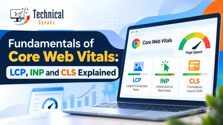
Slow pages lose visitors before they see your offer. Check the page in PageSpeed Insights and focus on Core Web Vitals:
- LCP (Largest Contentful Paint): how quickly the main content appears. Compress and resize images, and use modern formats like WebP.
- INP (Interaction to Next Paint): how quickly the page responds to taps and clicks. Cut heavy scripts and unnecessary plugins.
- CLS (Cumulative Layout Shift): how much the layout jumps around. Set image dimensions and avoid late-loading banners.
On WordPress, our guide to speeding up WordPress covers the practical fixes.
Step 10: Optimize for search (when it makes sense)
Paid campaign pages are often set to noindex so they don’t compete with your main pages. If you want the page to rank organically:
- Target one main keyword and use it naturally in the title, H1 and copy.
- Write a clear title tag and meta description. See our guide to meta tags.
- Add descriptive alt text to images.
- Include a short FAQ that answers real questions. It also helps AI answer engines understand the page.
- Link to it from relevant pages on your site.
A strong title and meta also improve your click-through rate in search.
Step 11: Set up tracking before launch
You can’t improve what you don’t measure.
- GA4: mark form submissions, calls or the thank-you page view as key events (conversions).
- Google Ads or Meta: import or set up conversions so campaigns optimize for real leads, not just clicks.
- UTM tags on every link you send to the page, so you know which source converts best.
- Microsoft Clarity (free) for heatmaps and session recordings that show where people scroll, click and drop off.
Step 12: Test, launch and keep improving
Before launch:
- Test the form end to end. Does the email arrive? Does the thank-you page load?
- Check the page on several phones and browsers.
- Proofread every word and check every link.
After launch:
- Let it collect enough traffic before judging it.
- Watch Clarity recordings to spot confusion: rage clicks, people stopping before the CTA, form fields they abandon.
- A/B test one change at a time: the headline, the CTA text, the hero image, the form length or the order of proof. Many page builders include A/B testing, and tools like VWO offer dedicated testing.
- Keep the winner, then test the next idea.
Common landing page mistakes
- Sending ad traffic to the homepage
- A headline that doesn’t match the ad
- Multiple competing CTAs
- Long forms asking for information you don’t need yet
- No proof, or vague testimonials with no name
- Slow loading on mobile
- Intrusive popups that cover the content on mobile, which annoy visitors and can hurt how Google sees the page
- No conversion tracking, so you’re guessing
Tools to create and optimize landing pages
| Need | Tools |
|---|---|
| Build | WordPress + Elementor, Divi or the block editor; Unbounce; Leadpages; Wix; Webflow |
| Speed | PageSpeed Insights, image compression plugins, caching |
| Tracking | GA4, Google Tag Manager, Google Ads conversions |
| Behavior | Microsoft Clarity, Hotjar |
| Testing | Built-in builder A/B tests, VWO |
| Copy help | AI writing assistants (always edit the output) |
Landing page checklist
| ✔ | Item |
|---|---|
| ☐ | One goal and one audience defined |
| ☐ | Headline matches the ad or link |
| ☐ | Clear hero: headline, subheadline, CTA, image |
| ☐ | Benefits, how it works, proof, FAQ |
| ☐ | One main CTA with action plus value text |
| ☐ | Short form with privacy note and spam protection |
| ☐ | Thank-you page |
| ☐ | Mobile-friendly and fast (Core Web Vitals checked) |
| ☐ | GA4 key events + ad conversions + UTMs |
| ☐ | Clarity installed |
| ☐ | Form, links and devices tested |
| ☐ | First A/B test planned |
FAQ
What makes a landing page convert?
A clear offer that matches what the visitor clicked on, a benefit-led headline, one strong CTA, real proof, a short form and fast loading on mobile.
How long should a landing page be?
As long as it needs to be to answer the visitor’s questions. Simple, free offers can be short. Expensive or complex offers usually need more detail, proof and FAQs.
Should a landing page have navigation?
Usually not. Removing or minimizing the menu keeps visitors focused on the one action you want.
Can I create a landing page in WordPress?
Yes. You can use the block editor or a page builder like Elementor or Divi, with a blank or full-width template.
Should landing pages be indexed by Google?
It depends. Campaign-only pages are often set to noindex to avoid duplicate content. Pages you want to rank should be indexed and optimized like any other page.
What’s a good landing page conversion rate?
It varies widely by industry, offer and traffic source, so compare against your own past results rather than a general number. Aim to improve your rate steadily through testing.
Final thoughts
A landing page that converts isn’t about fancy design. It’s about focus. One goal, one message that matches the click, clear proof, a short form and a fast page. Track everything from day one, test one change at a time, and the page will keep getting better.
Building a new site as well? Start with our guide to SEO for a new website, and keep your site safe with our WordPress security checklist. If you’re focused on revenue, see how SEO performance marketing connects traffic to sales.
Need a landing page that actually brings in leads? Get in touch with our team today.
Saurabh K. has been working in SEO and digital marketing for 10+ years, helping businesses grow their search traffic.